CHT-002
Radar comparison
- Two polygons unfold from the centre in turn and overlap.
Make a radar chart comparing scores per item for two series. The axes are the items in the first column and the series are the other columns. Polygons unfold from the centre one series at a time and overlap semi-transparently so the difference shows. Write each series' average on the right.

[paste your table here]

The first row is the header. Put CSS and JavaScript in a single HTML file and draw with canvas or SVG, without external libraries. Dark background, crisp numbers and text, and no overlapping text even at phone width. If prefers-reduced-motion is on, show the finished chart without motion.
항목별 점수를 두 계열로 비교하는 방사형 차트를 만들어 주세요. 축은 첫 열의 항목, 계열은 나머지 열이에요. 다각형이 가운데에서 계열마다 차례로 펼쳐지고, 반투명하게 겹쳐 차이가 보여요. 오른쪽에 계열별 평균을 적어 주세요.
[여기에 표 붙여넣기]
첫 줄은 머리글이에요. HTML 파일 하나에 CSS와 JavaScript를 넣고, 외부 라이브러리 없이 canvas나 SVG로 그려 주세요. 어두운 배경에 숫자와 글자는 또렷하게, 휴대폰 폭에서도 글자가 겹치지 않게 해 주세요. prefers-reduced-motion이 켜져 있으면 움직임 없이 다 그려진 차트를 보여 주세요.Blanks
How to use
- Borrow (copy) the prompt.
- Replace the [brackets] with your own content. Type in the fields below and it updates at once.
- Paste it into a new Claude chat and open the HTML file it returns in a browser.
Process
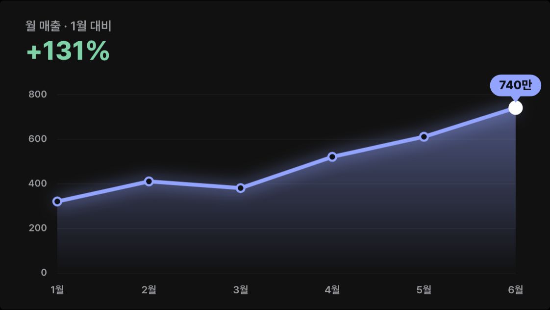
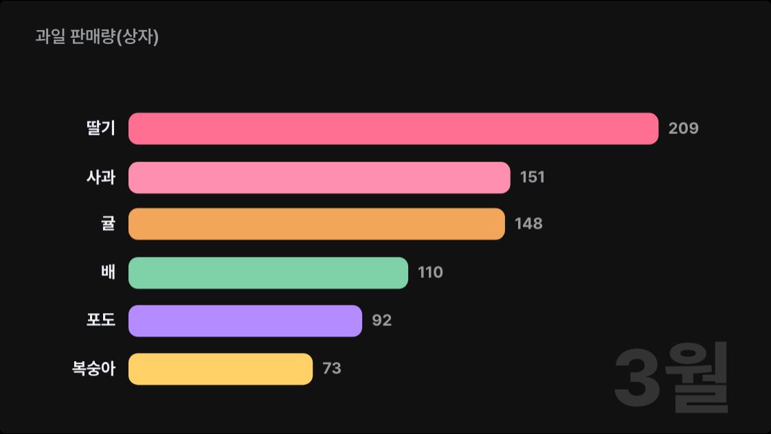
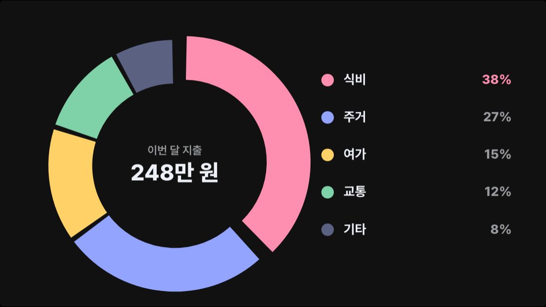
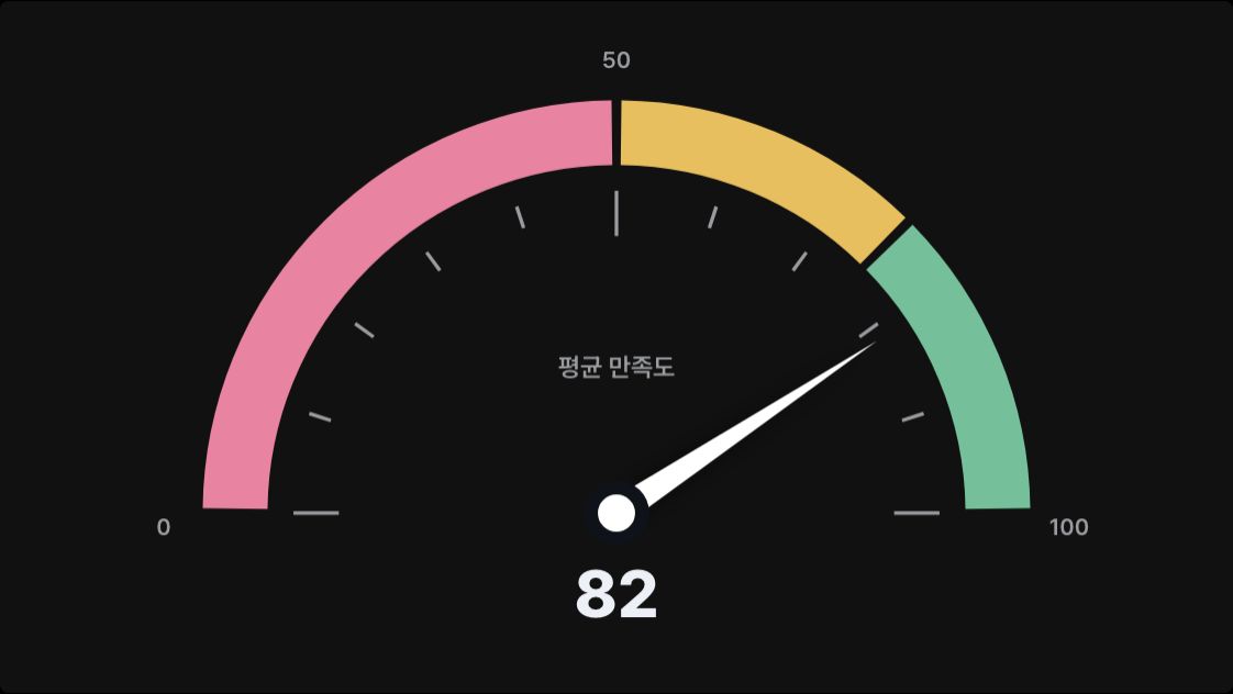
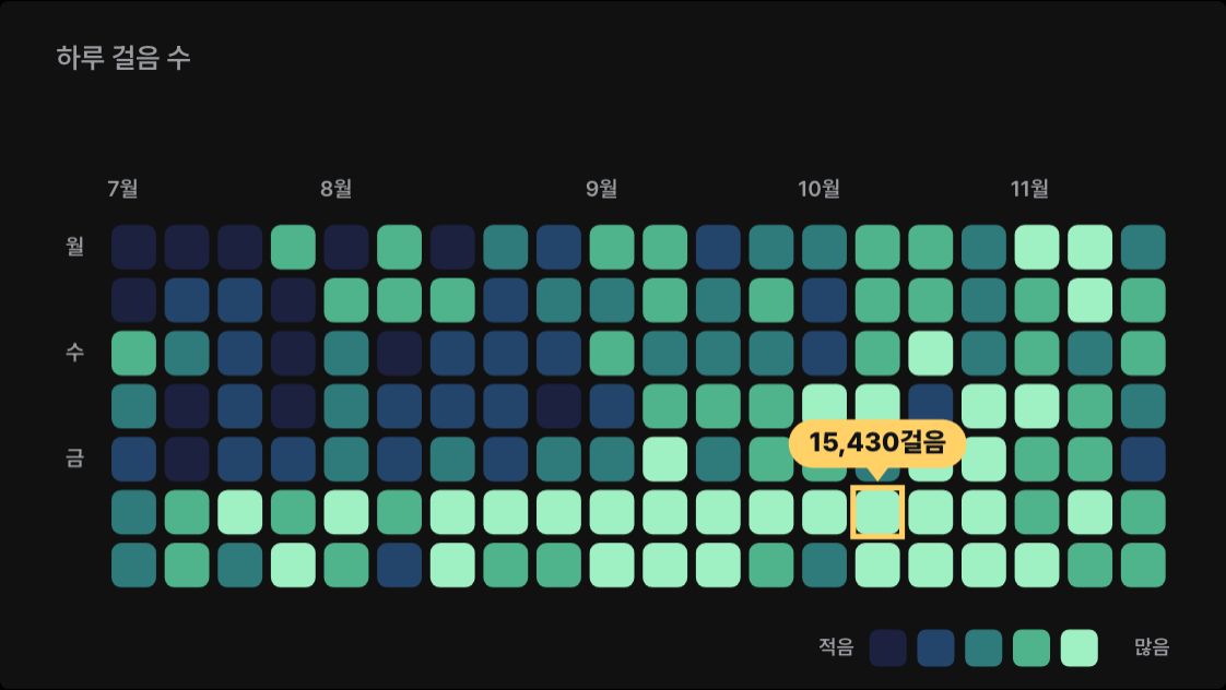
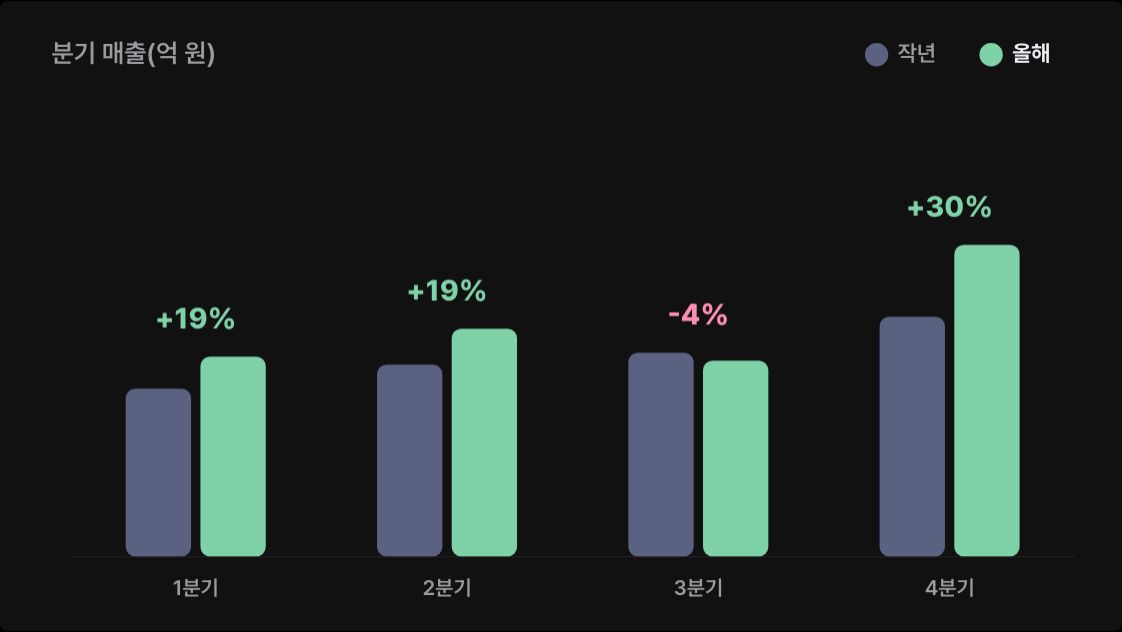
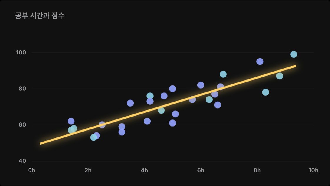
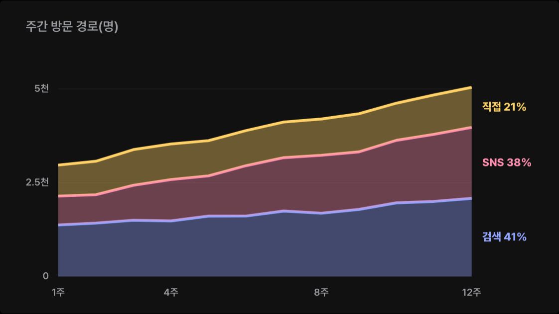
- A scene from the guide "Animated data charts with Claude".
- The preview is drawn on this site to show the scene this prompt makes.