CHT-005
Two-period comparison
- Bars grow in turn and the change pops up above them.
Make a grouped bar chart comparing two periods side by side. The previous period is a faint grey and this period is [accent colour]. Bars grow group by group, and when they finish the change pops up above them, green when it rose and pink when it fell.

[paste your table here]

The first row is the header. Put CSS and JavaScript in a single HTML file and draw with canvas or SVG, without external libraries. Dark background, crisp numbers and text, and no overlapping text even at phone width. If prefers-reduced-motion is on, show the finished chart without motion.
두 기간을 나란히 비교하는 묶음 막대 차트를 만들어 주세요. 이전 기간은 흐린 회색, 이번 기간은 [강조 색]이에요. 막대가 묶음마다 차례로 자라고, 다 자라면 위에 증감률이 오르면 초록, 내리면 분홍으로 튀어나와요.
[여기에 표 붙여넣기]
첫 줄은 머리글이에요. HTML 파일 하나에 CSS와 JavaScript를 넣고, 외부 라이브러리 없이 canvas나 SVG로 그려 주세요. 어두운 배경에 숫자와 글자는 또렷하게, 휴대폰 폭에서도 글자가 겹치지 않게 해 주세요. prefers-reduced-motion이 켜져 있으면 움직임 없이 다 그려진 차트를 보여 주세요.Blanks
How to use
- Borrow (copy) the prompt.
- Replace the [brackets] with your own content. Type in the fields below and it updates at once.
- Paste it into a new Claude chat and open the HTML file it returns in a browser.
Process
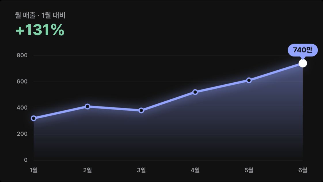
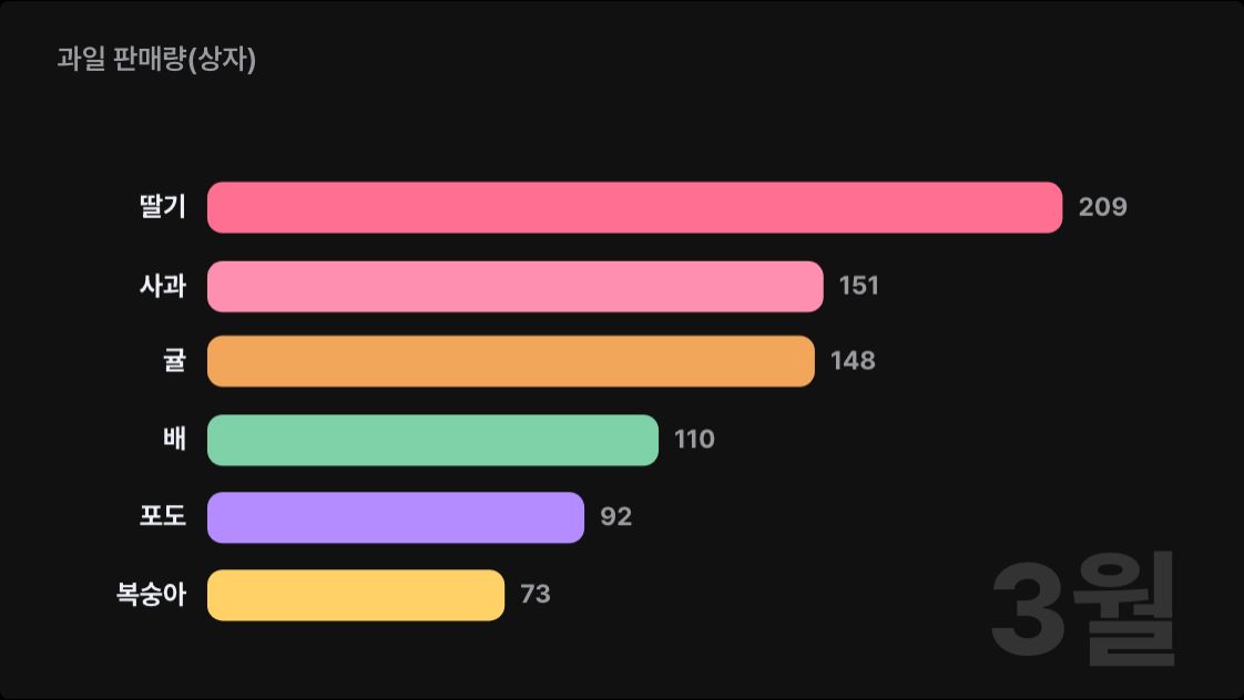
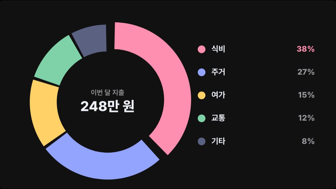
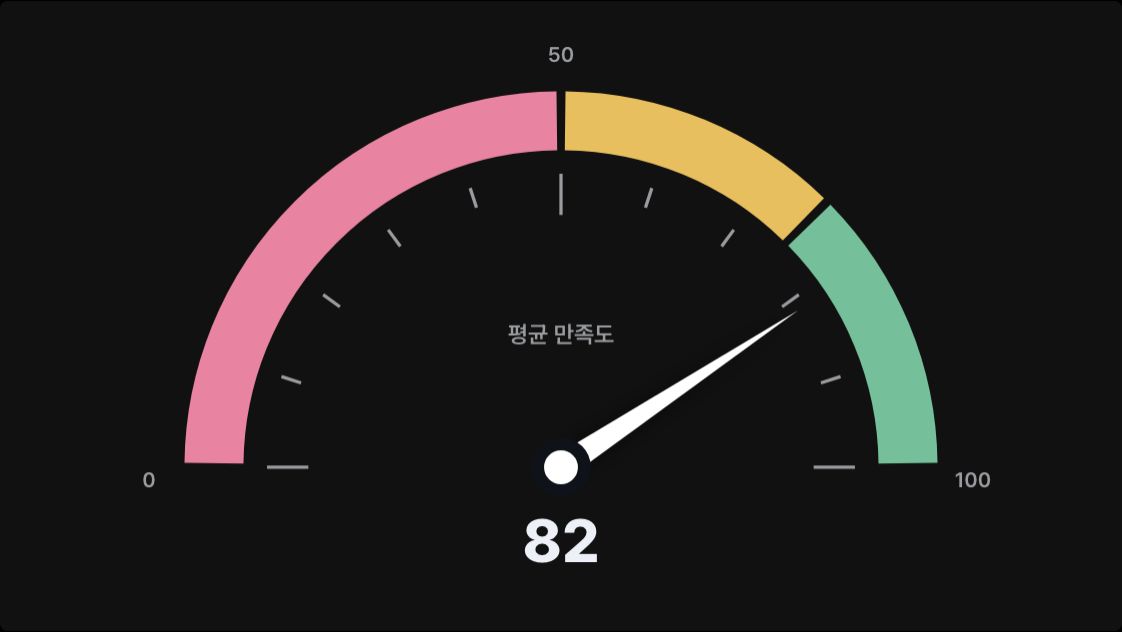
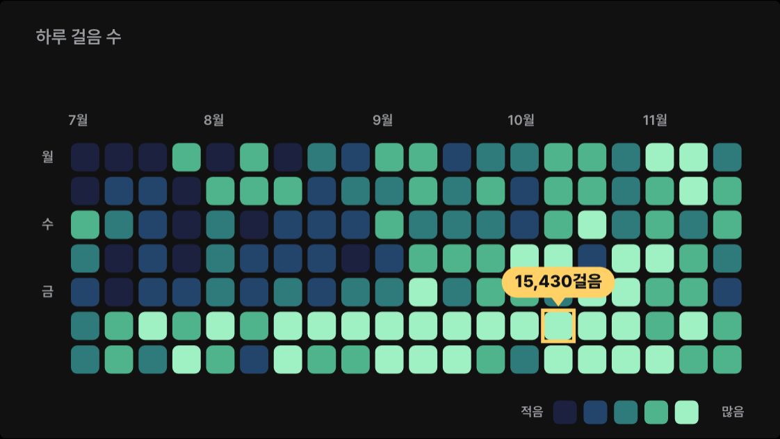
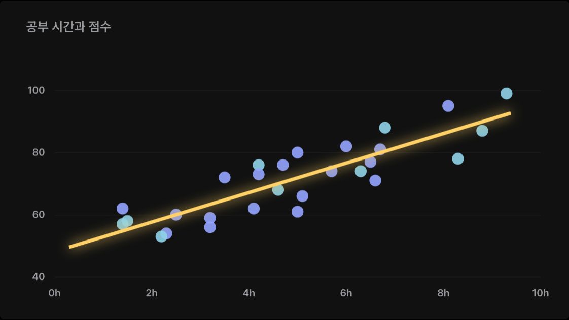
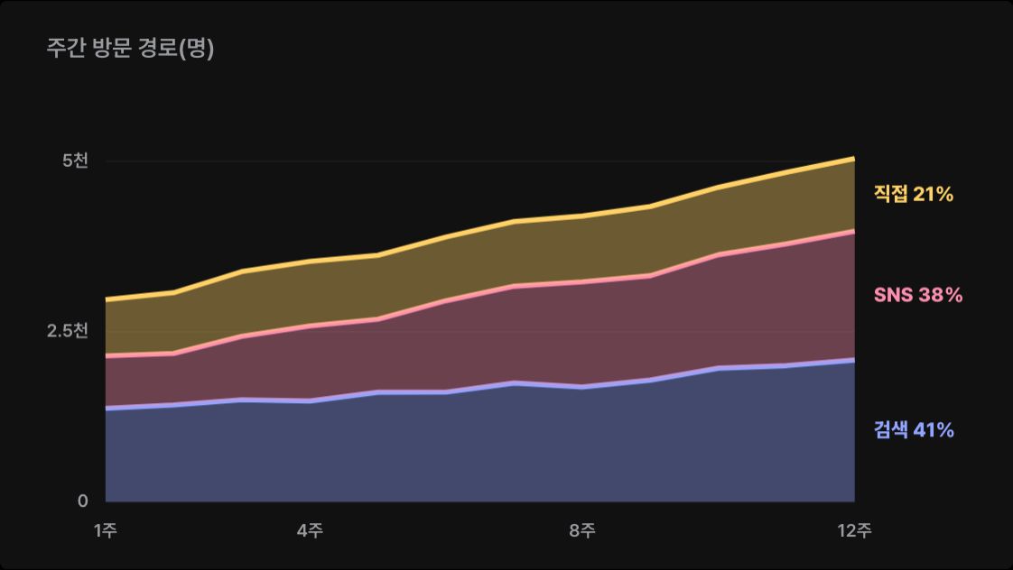
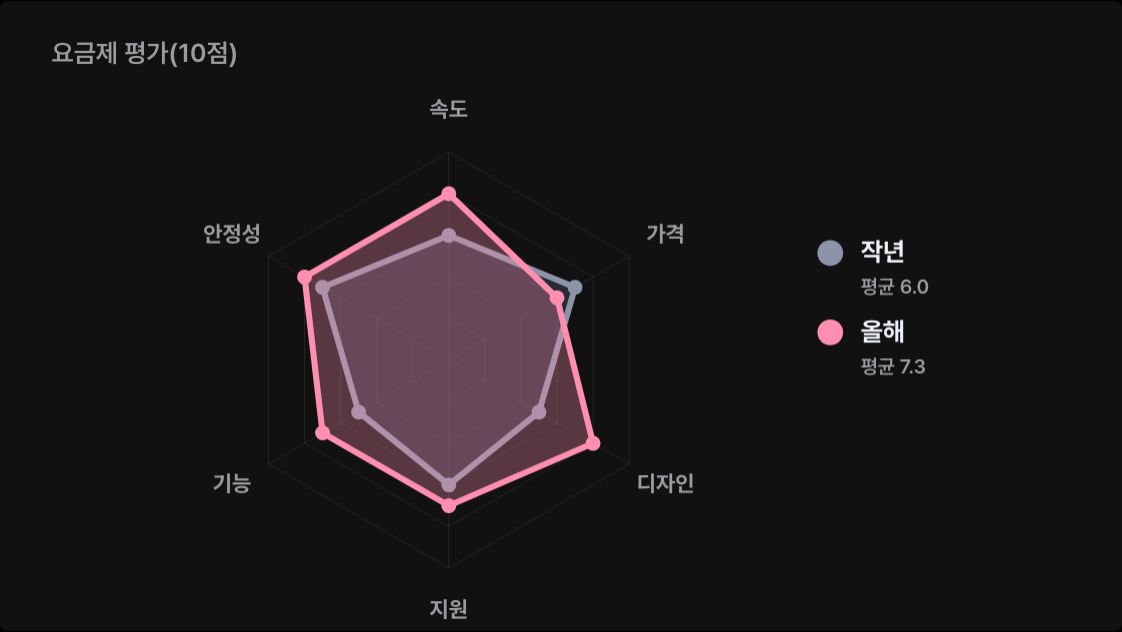
- A scene from the guide "Animated data charts with Claude".
- The preview is drawn on this site to show the scene this prompt makes.